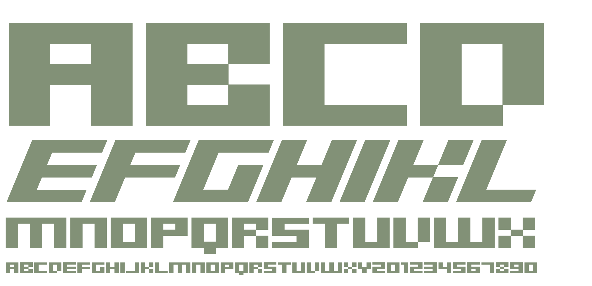
SB Superbloc
Regular / Italic
A heavily geometric design, SB Superbloc is designed to pack a punch both on screen and in print. It is impressive as a headline typeface but also works well at smaller sizes thanks to its bold, crisp and angular geometry. SB Superbloc is a capitals only typeface, in line with its bold, brash nature. Its combination of pixel-like features and sharp vectored corners make it simultaneously retro and futuristic.
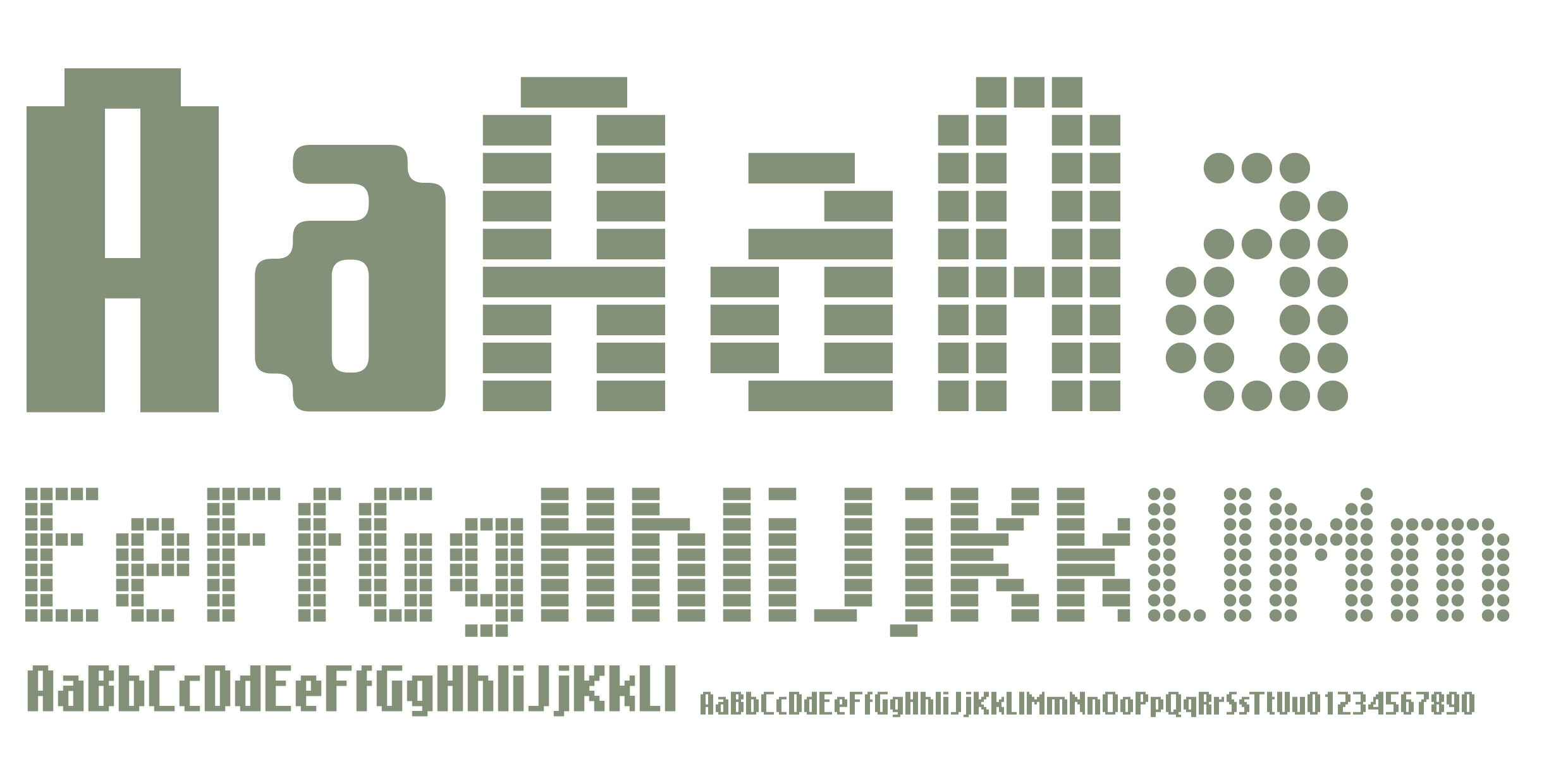
SB Message
Solid / Open / Line / Rounded / Dot
SB Message is a typeface inspired by the font used on the old Nokia cellphone displays. SB Message takes its cues from the Nokia font, but critically it is taller and narrower, improving its impact as a display typeface for use in headlines. Initially only two styles were produced, Solid and Open, aimed at creating a screen-like headline, but later dot matrix, VDU line and rounded pixelfont versions were added.
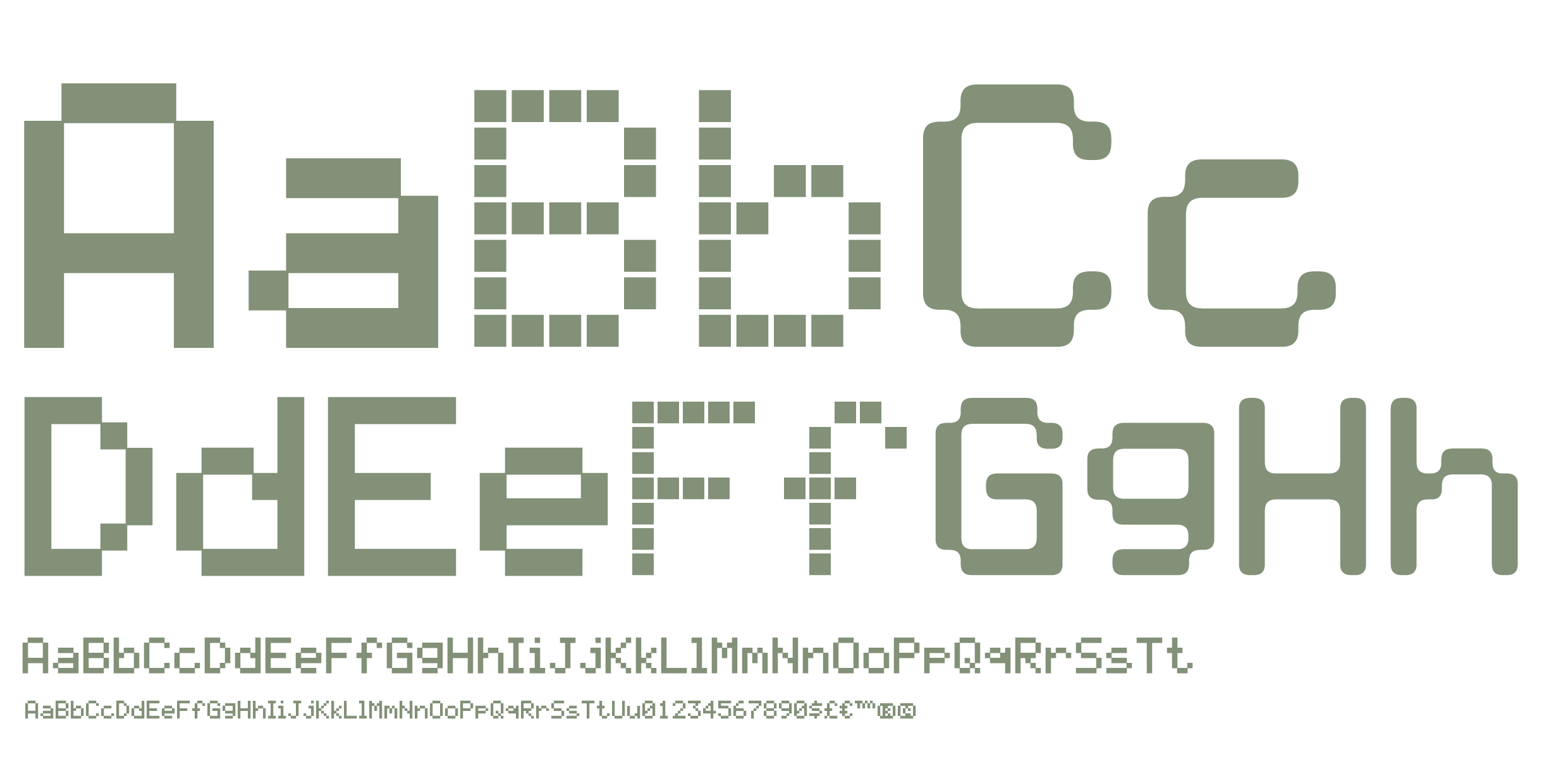
SB Liquid
Solid / Open / Rounded / Dot
SB Liquid is a digitisation of the 5x8 pixel typeface used on many Liquid Crystal Display panels, including the ubiquitous Hitachi HD44780. SB Liquid was originally referenced from the display of a Kawai K-1 synthesizer, a musical instrument that used an 16x2 character LCD strip to display information about the sound to the musician playing it.
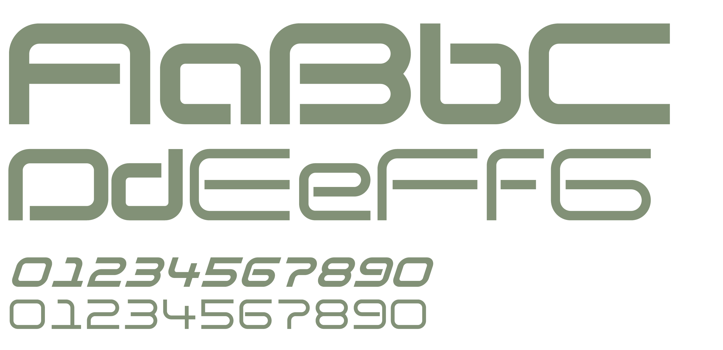
SB Vibe
Family of 50 fonts
SB Vibe is a geometric, monoline sans-serif typeface with some stencil-like elements, featuring short ascenders and a large x-height. Its linear, rectangular, curved letterforms suggest speed and efficiency and this makes it well suited to sports, automotive, audio and technology themed projects.
SB Navigator
Regular / Rounded
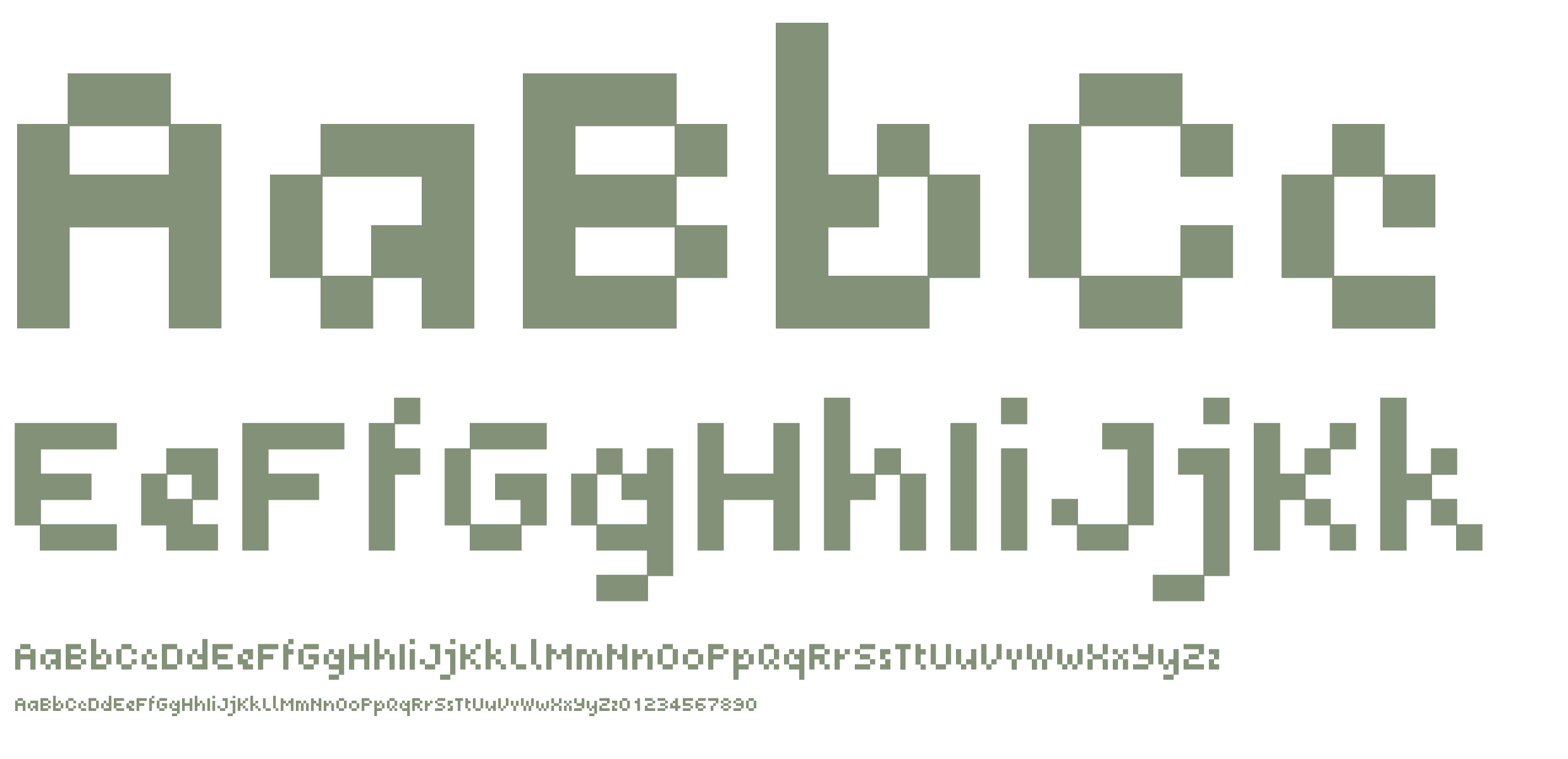
SB Navigator was designed for screen use, as a legible text typeface for use in website navigation menus. It was intended to be used as part of static pixel graphics or as part of a Flash animated menu, in the days when the web was a low-resolution experience. SB Navigator also performs well as a text font, retaining good legibility at small sizes.
SB Websnap
Regular / Rounded / Disconnect
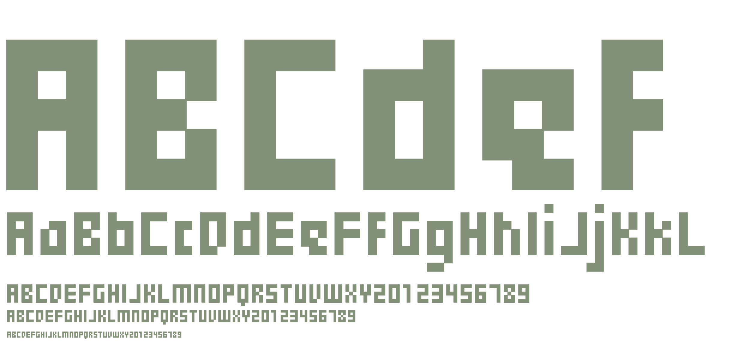
SB Websnap was designed for use in pixel graphics and as a Flash compatible pixelfont, both of which were popular as designers experimented with ways to improve the way the web looked and functioned. Later, rounded versions of the original pixelfont were added, opening up it to use as a headline typeface for today’s high-DPI screens.
SB Expo
Regular / Rounded
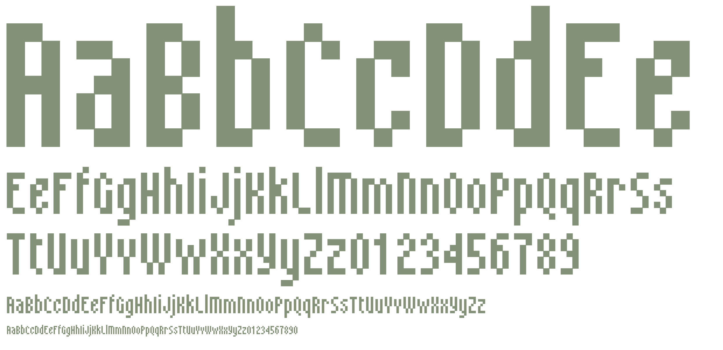
SB Expo is a condensed pixelfont and retains a high degree of legibility at small sizes. It is intended to be used where space is at a premium, such as in banner adverts and photo credits. It is optimised for use at 10px but it also works well at 20px as a typeface for subheadings due to its condensed letterforms. This font also contains a rounded pixelfont version, opening it up to usage as a display typeface.
SB Modem
Rounded / Open / Square
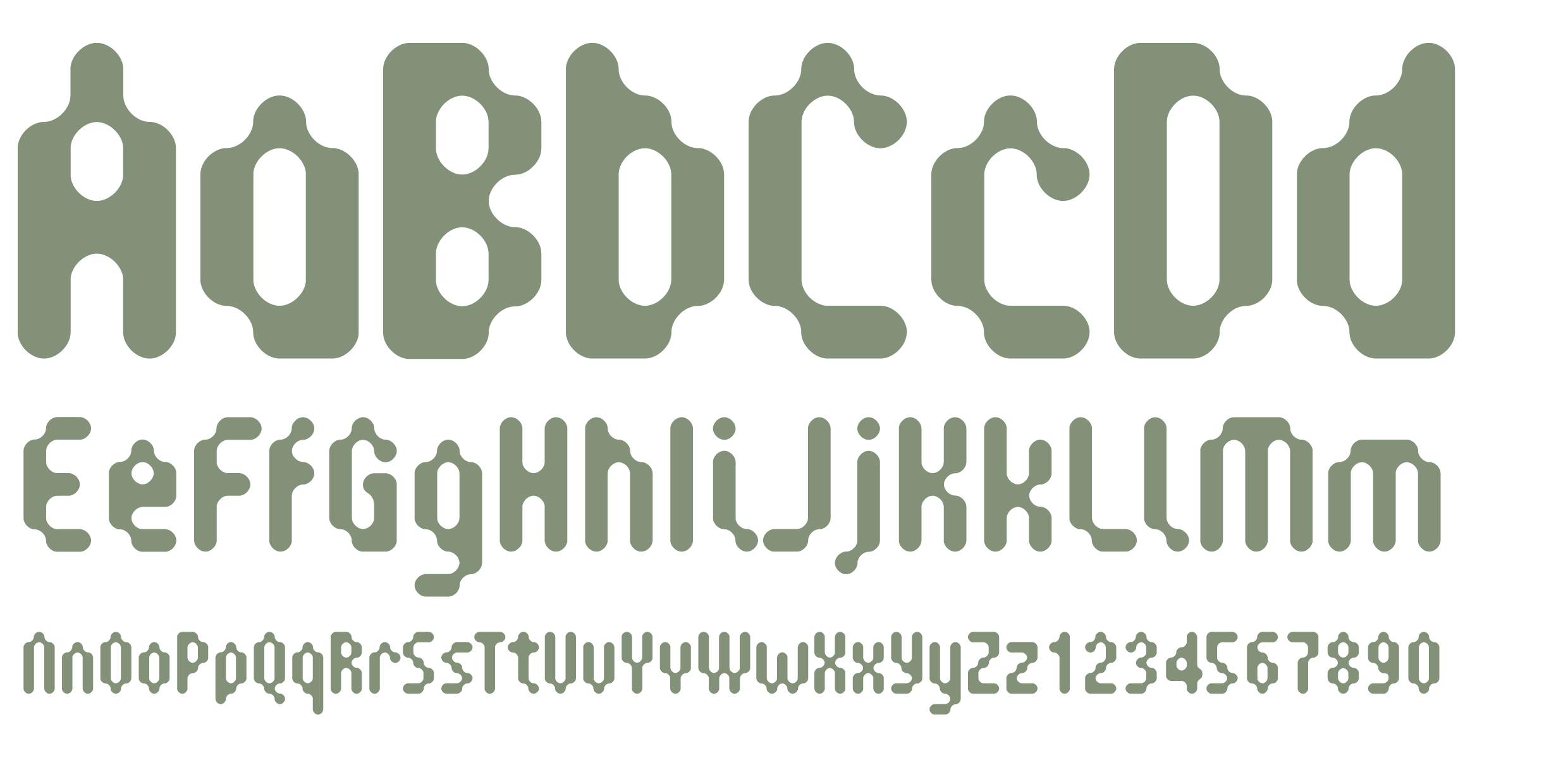
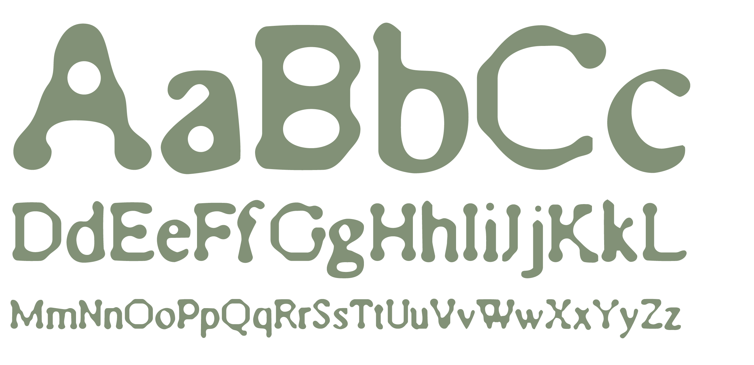
SB Modem’s curved, bubble-like aesthetic is infused with retro-futurism and evokes the space age dreams of what life might be like for humanity in the far future of the year 2000. Although SB Modem has its origins in the 1990s, it owes something to the designers and artists of the 1960s, who developed a visual style that embodied the optimistic hopes people had for the potential of technology to improve peoples’ lives.
SB Degenerate
Regular
SB Degenerate is a grunge font, and although it has a distinctly inky, printed look, this typeface was created using entirely digital methods. The original source material was the suitcase of low-resolution screen fonts for Times New Roman, which were taken into Photoshop and repeatedly blurred, filtered and brought back into focus, before being redrawn in vector form.
SB Grip
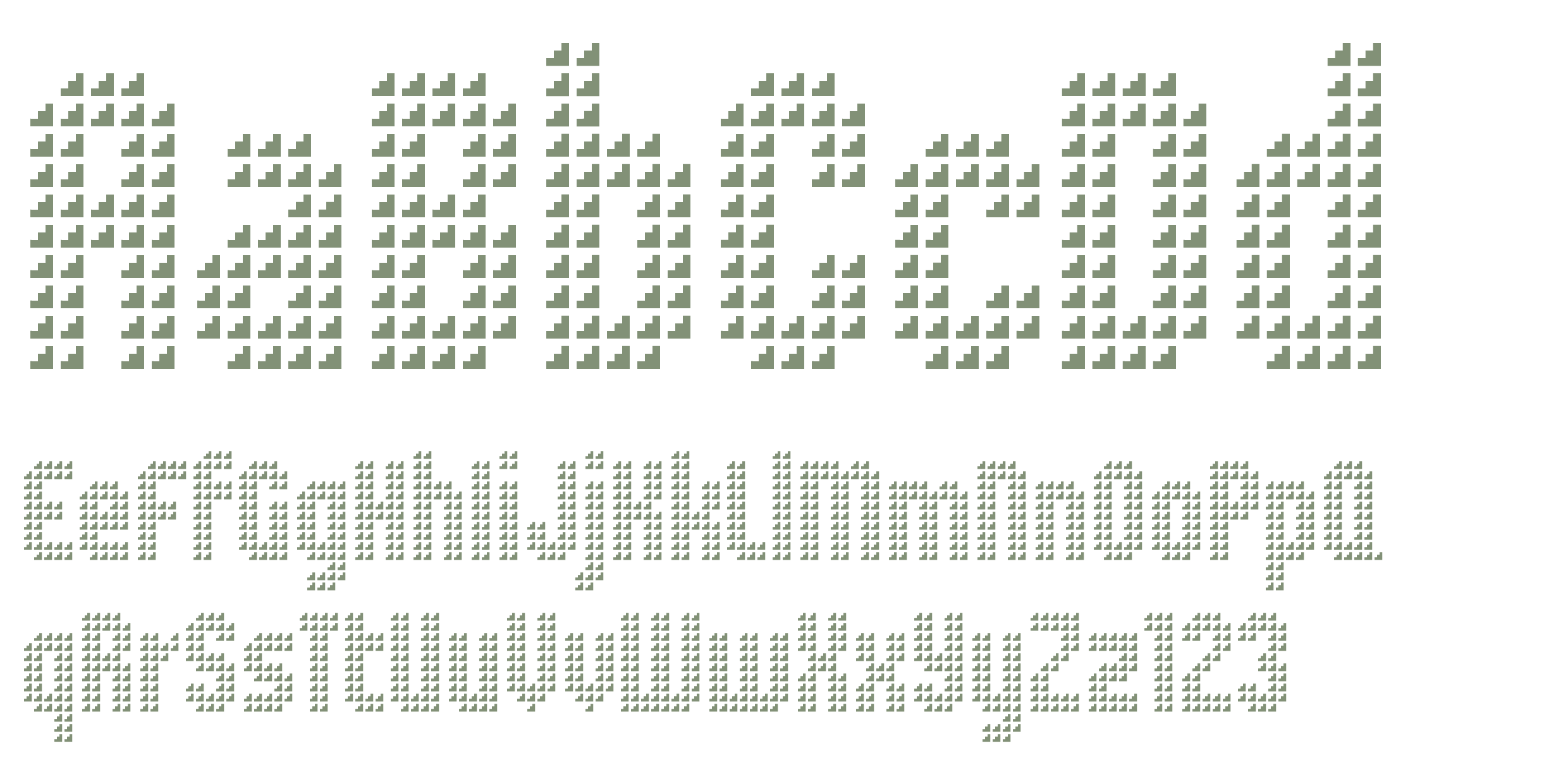
SB Grip was originally a pixelfont and took its name from its similarity to the type of gripped steel flooring that features a repeating pattern. It was based on a repeating, pixellated triangle and was designed to be layered over photography with the imagery showing through the spaces between the triangles. SB Grip has since been expanded into a large family of 71 styles.
SB Tokyo
Regular / Italic
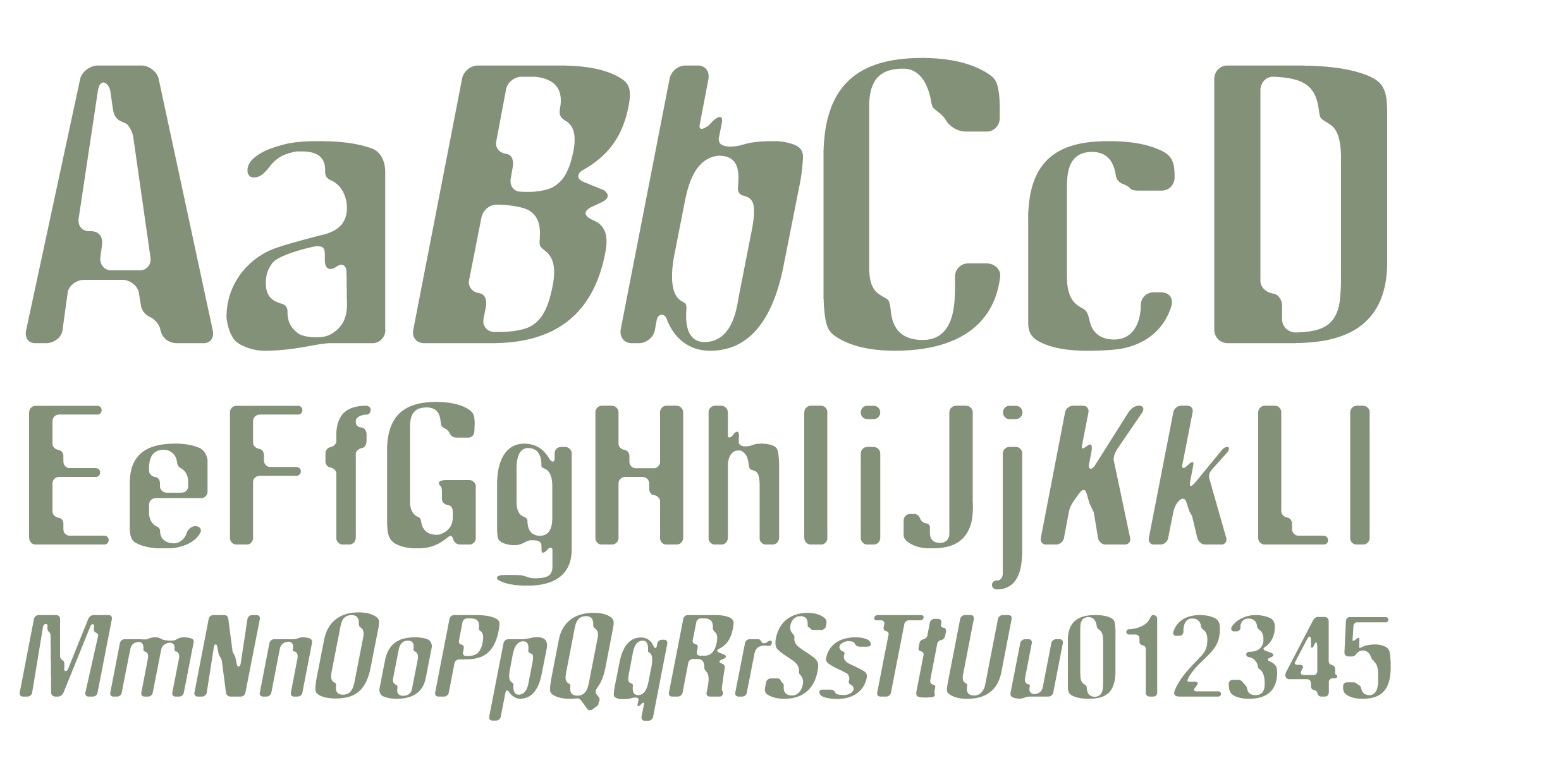
SB Tokyo originated as a piece of display lettering for a project on the theme of analogue photography which was paired with images of Tokyo’s neon light signage. The original piece involved a digitally filtered and blurred double exposure of Helvetica Condensed that had a pleasing combination of irregular, jagged shapes due to the way the double letterforms intersect with one another.
SB Byte
Regular / Italic
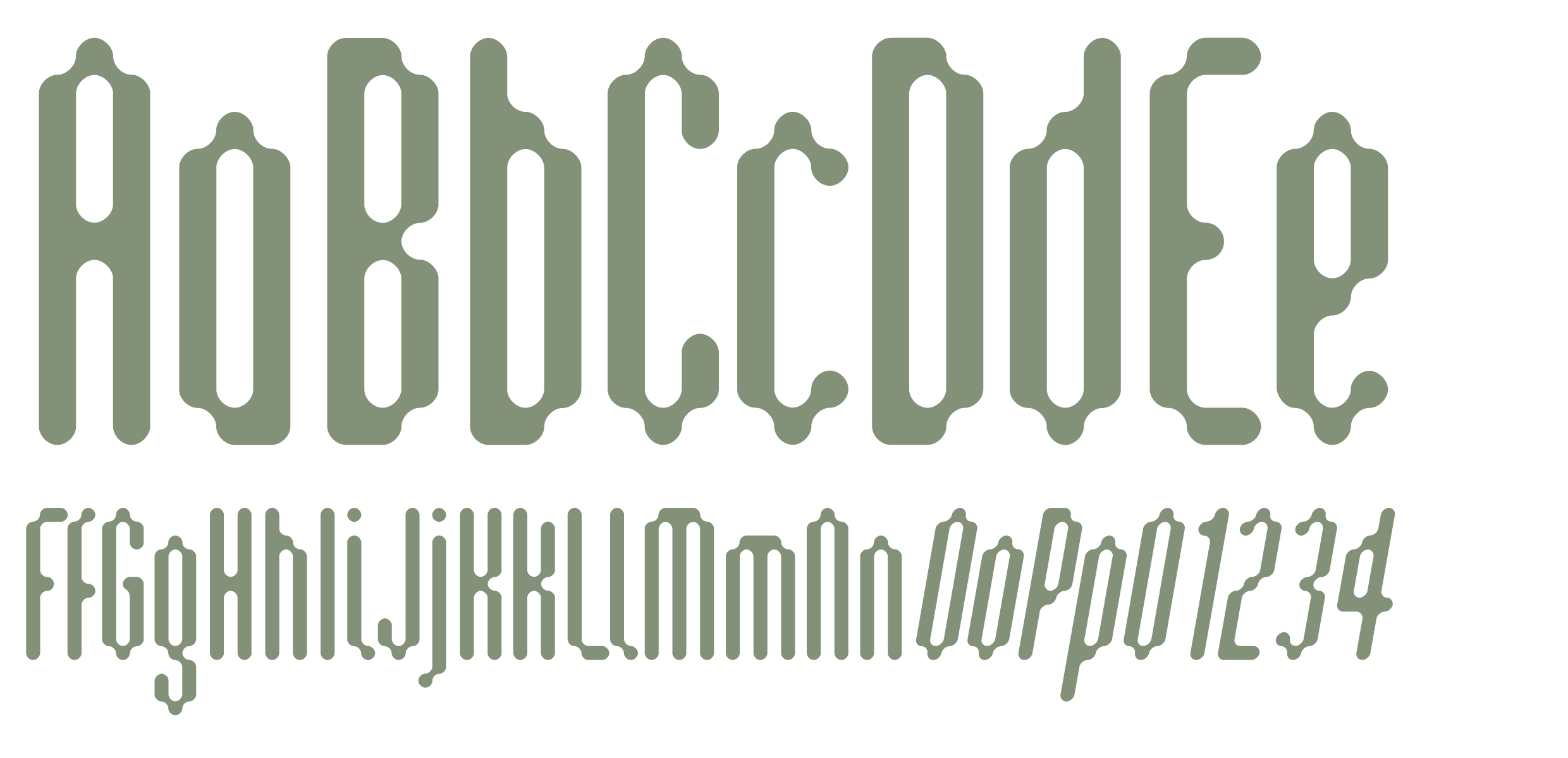
SB Byte is the result of experiments in an early version of Photoshop, inspired by Rudy VanderLans and Zuzanna Licko’s experiments in digital letterforms, as published in Emigre Magazine. The process involved drawing the glyphs pixel by pixel at a low resolution, increasing the resolution and applying the Gaussian Blur filter multiple times. Each time the Brightness and Contrast was adjusted to remove the blur and create a sharper, more defined edge.
SB Censor
Regular / Cameo
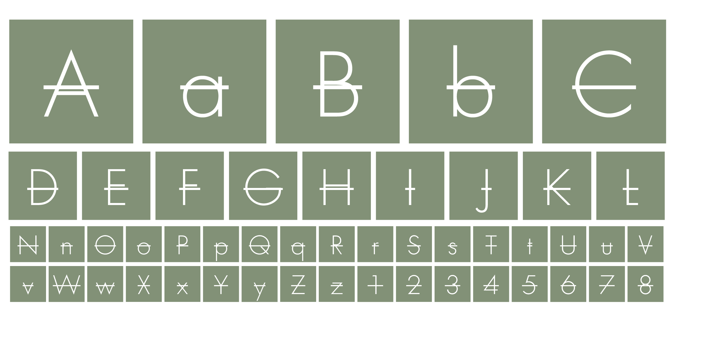
SB Censor originally came out of a project centered around the theme of censorship in cinema. The treatment of the letterforms was created in Quark XPress using the built-in strikethrough text styling, which was applied to each letter individually. The individual letters were spaced in a monospaced, grid-like fashion with some letters appearing reversed out of a box and others on their own.
SB Basement
Regular
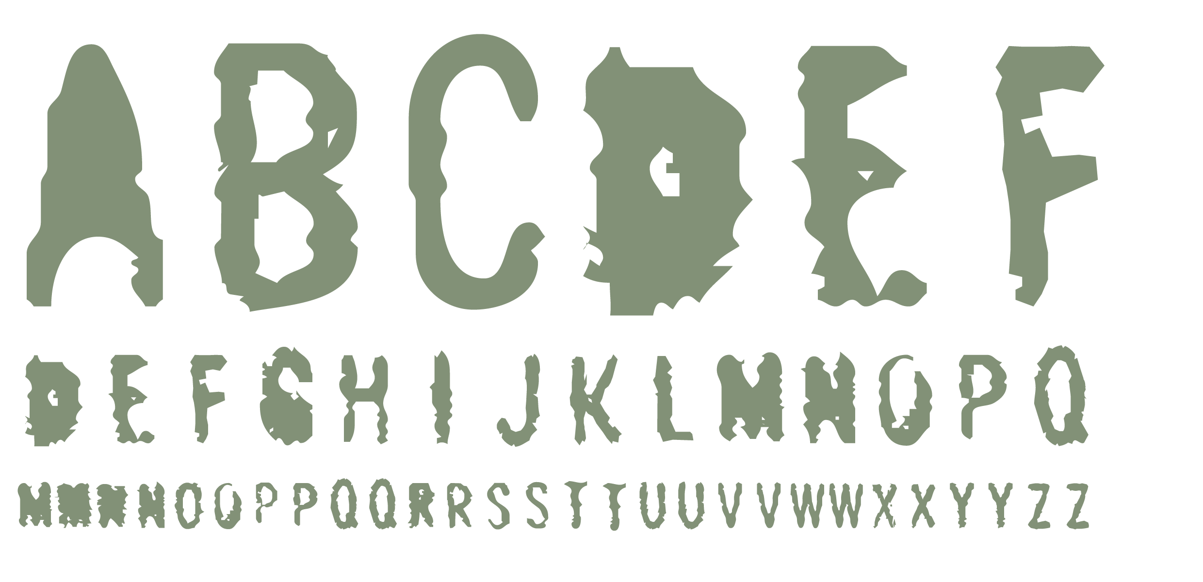
SB Basement’s letterforms were originally taken from roughly stamped cardboard outer cases found in a stockroom basement. The original letters were printed by a machine at speed, with bad ink smearing on a rough, porous cardboard resulting in a bad, often barely legible reproduction of the original letterforms. Various scans were made and taken into FreeHand 3 for auto tracing, adding another form of distortion.SelfBuild Type Foundry specialises in contemporary display typefaces and pixel typefaces that aim to find a better balance between function and style.
We released our first typefaces back in 1998 and since then our collection has steadily been growing with the addition of a range of pixel fonts designed for usage on websites and other screen applications. Our typefaces contain fully featured character sets and are available from FontSpring, Creative Market and Font Bundles.
All of our pixel fonts contain high quality vector outlines and are suitable for high-resolution print.
Copyright 2021 SelfBuild Type Foundry
